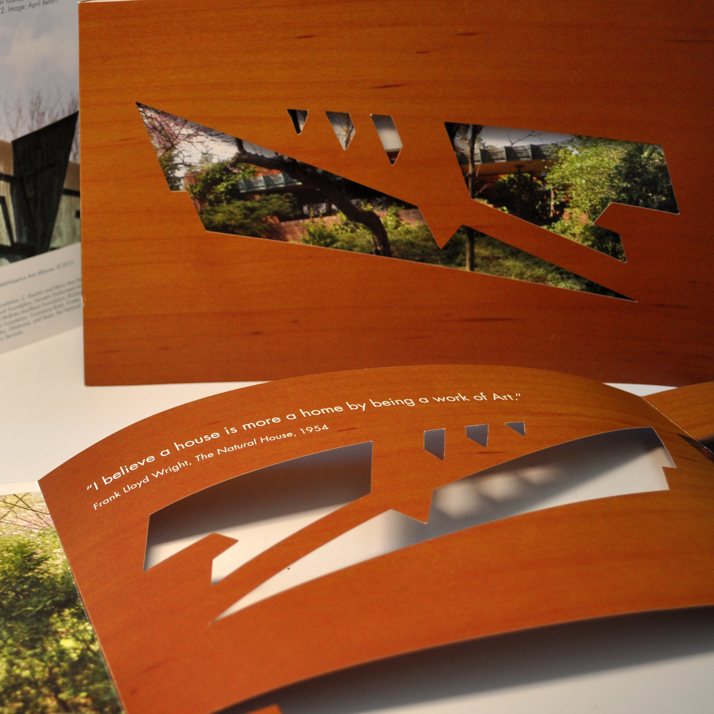
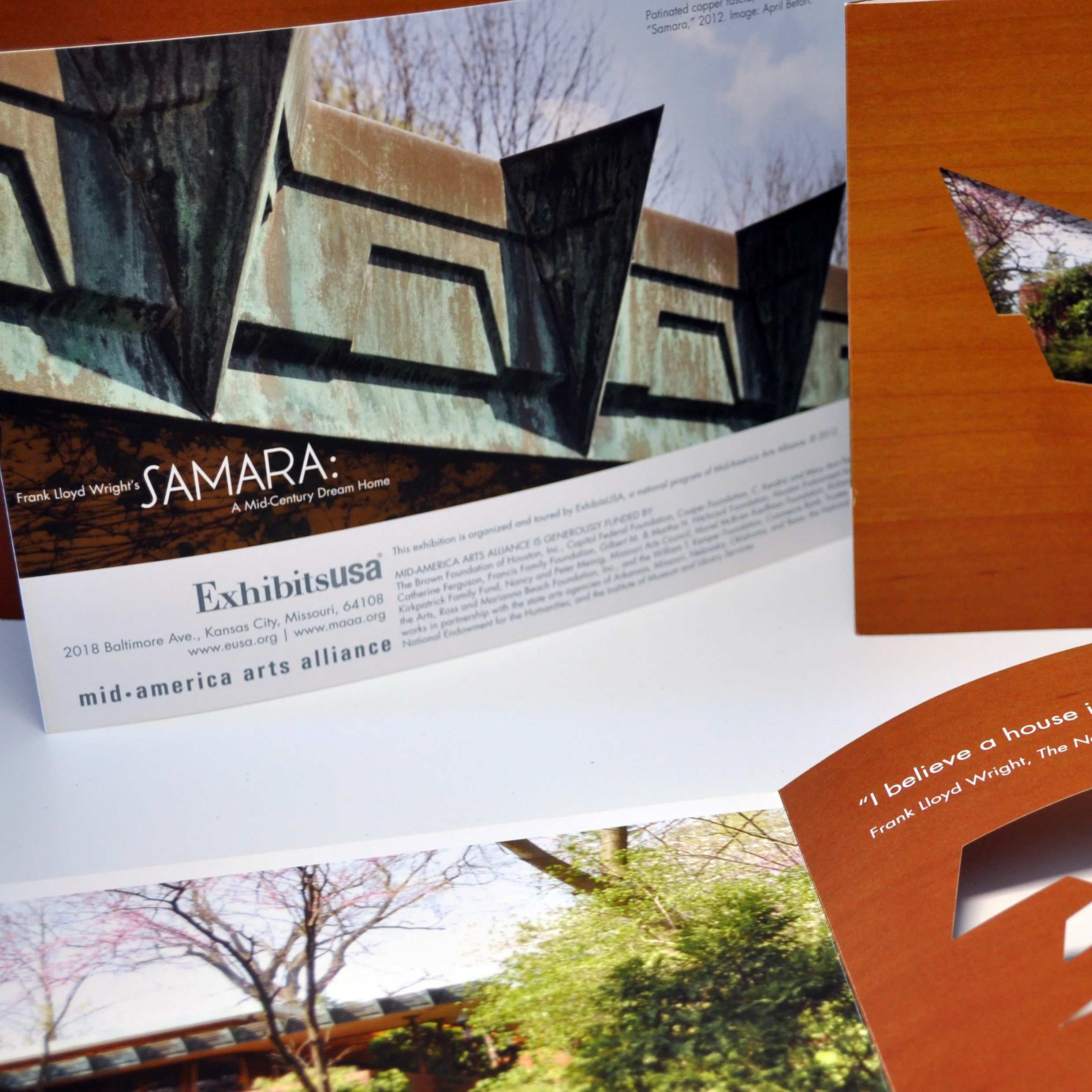

For so many reasons, I loved working on this exhibition. This brochure was one that I had creative freedom on, and I came up with this idea to have a custom dye cut made with wood grain inspired by the home. I used a gloss paper, with a matte soft touch coating to create a wood feel on the paper. I loved the way this brochure was so tactile and interesting with the cut out and paper treatment. It gives you a glimpse of what it’s like to walk in a Frank Lloyd Wright home.
I was able to actually travel to Samara and photograph the home.I loved using the images I captured in the brochure.
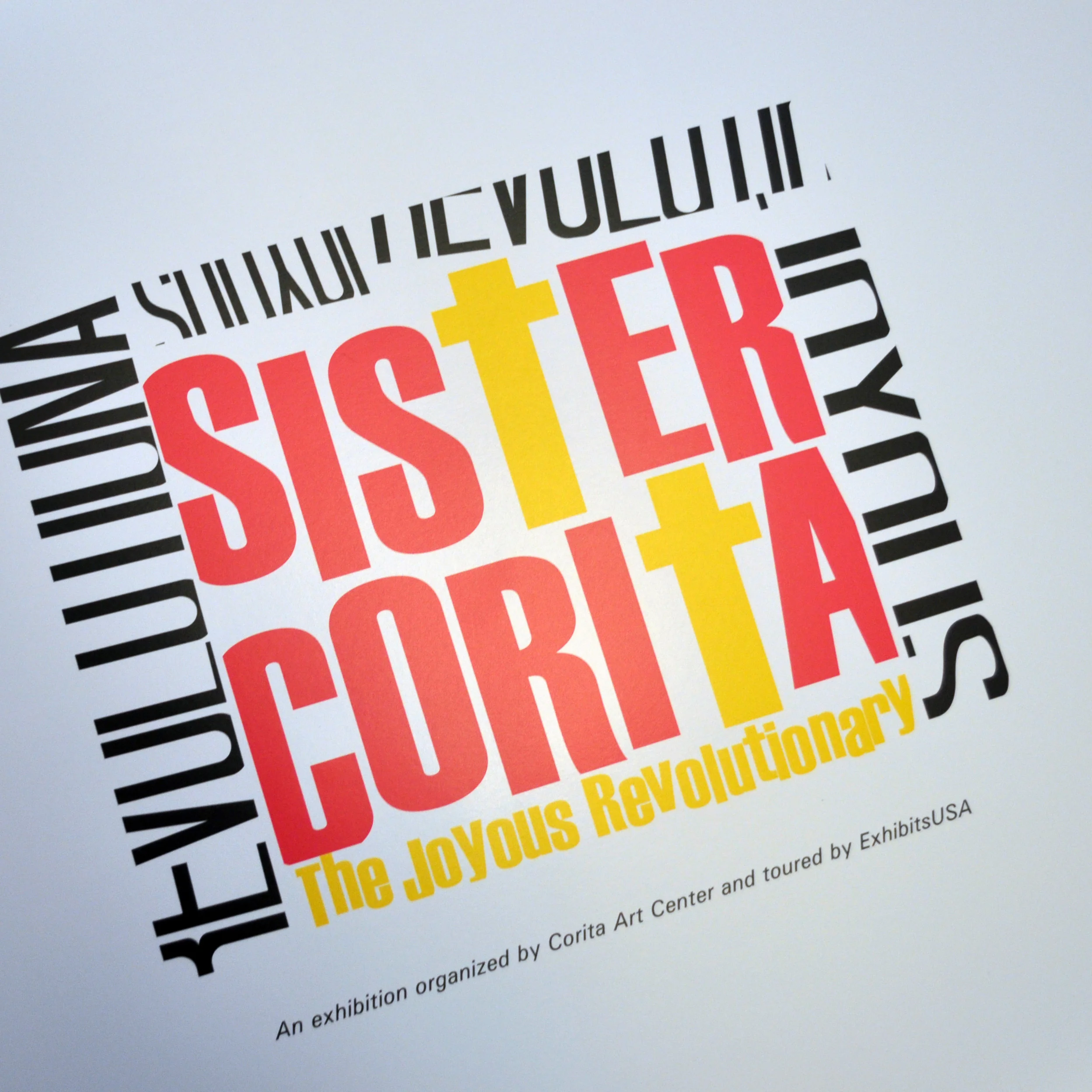
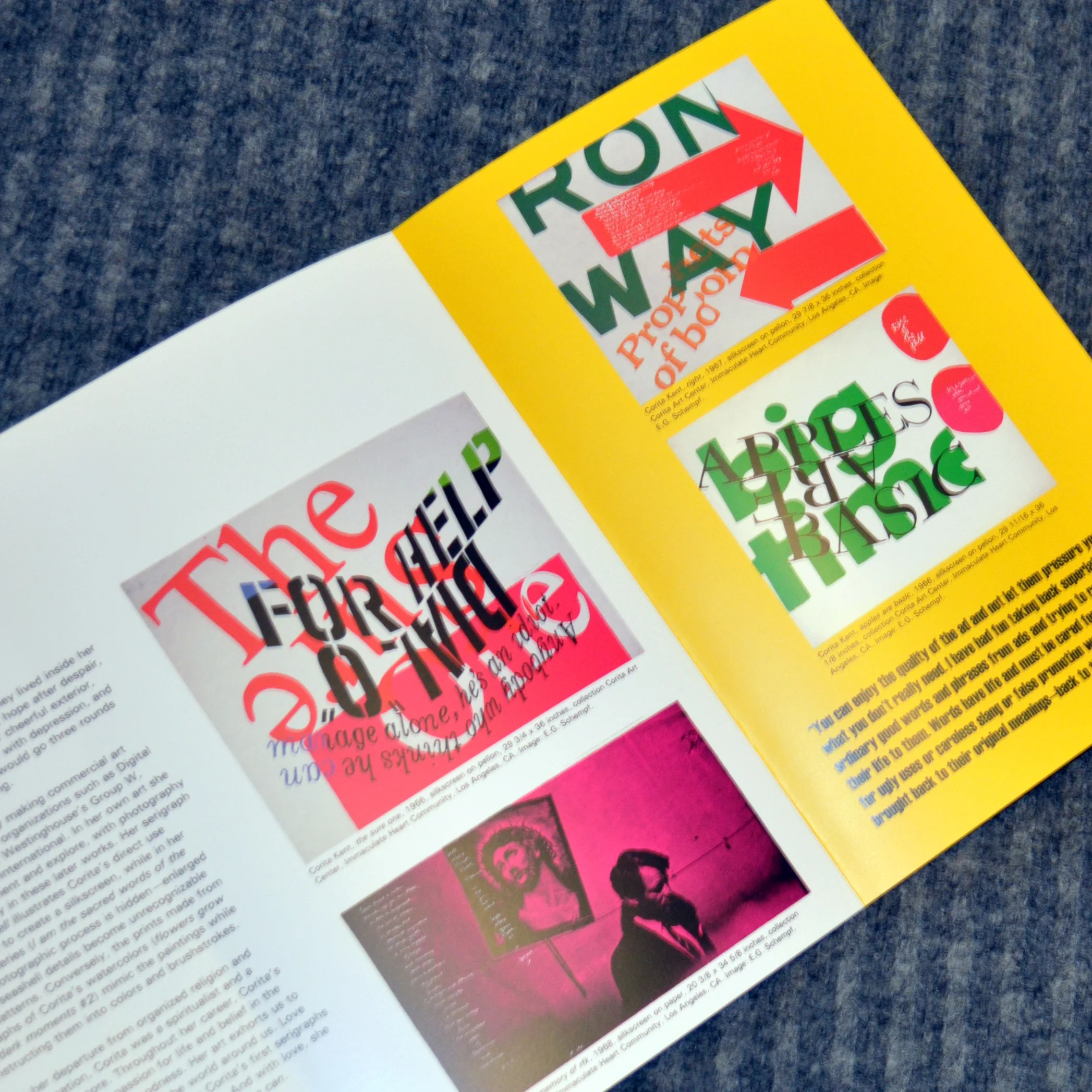
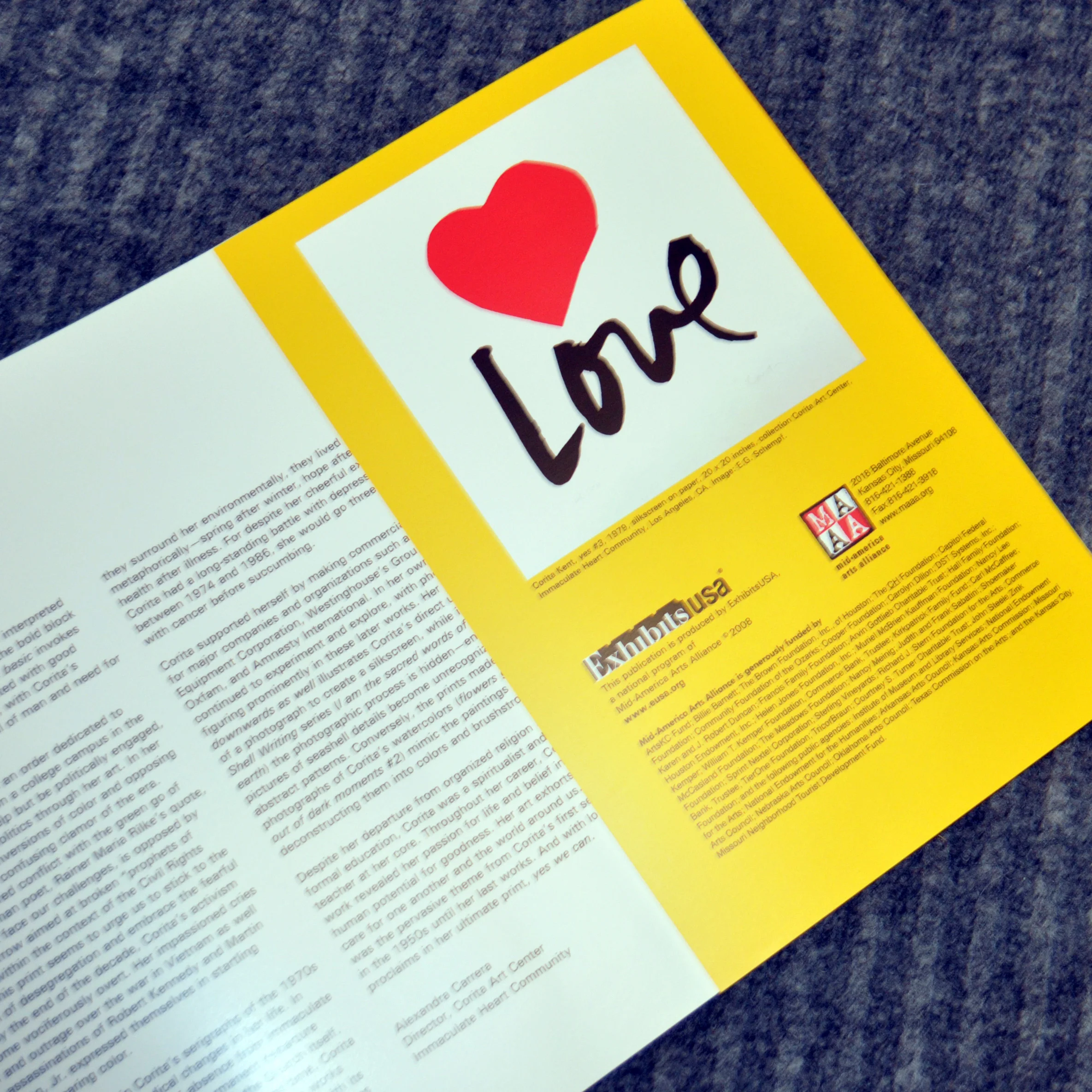
I had never heard of Sister Corita but was so glad I learned about her (especially as a female designer) through designing for this exhibition. Her work is bold and revolutionary.
Sister Corita’s work is so bold and bright, when I proofed the brochure, I wasn’t happy with how dull everything looked compared to the art. I worked with my print vendor rep, and we came up with a solution to use 50% CMYK ink and 50% neon CMYK ink mix. The result was sharp bold color that captured Corita’s work perfectly.
I designed this brochure to be oversized, with a half panel added in to feature even more artwork. After mixing in half neon CMYK ink, I also applied a UV coating to pop the colors even more.
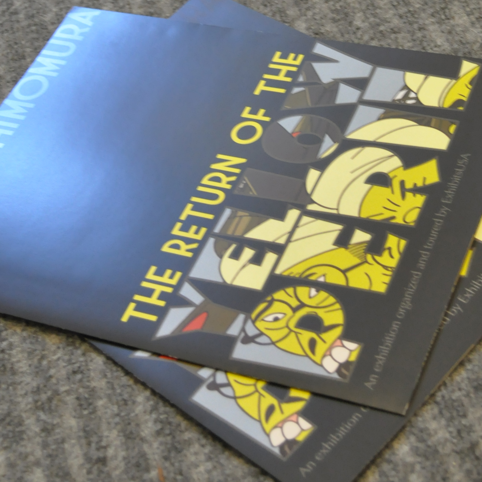
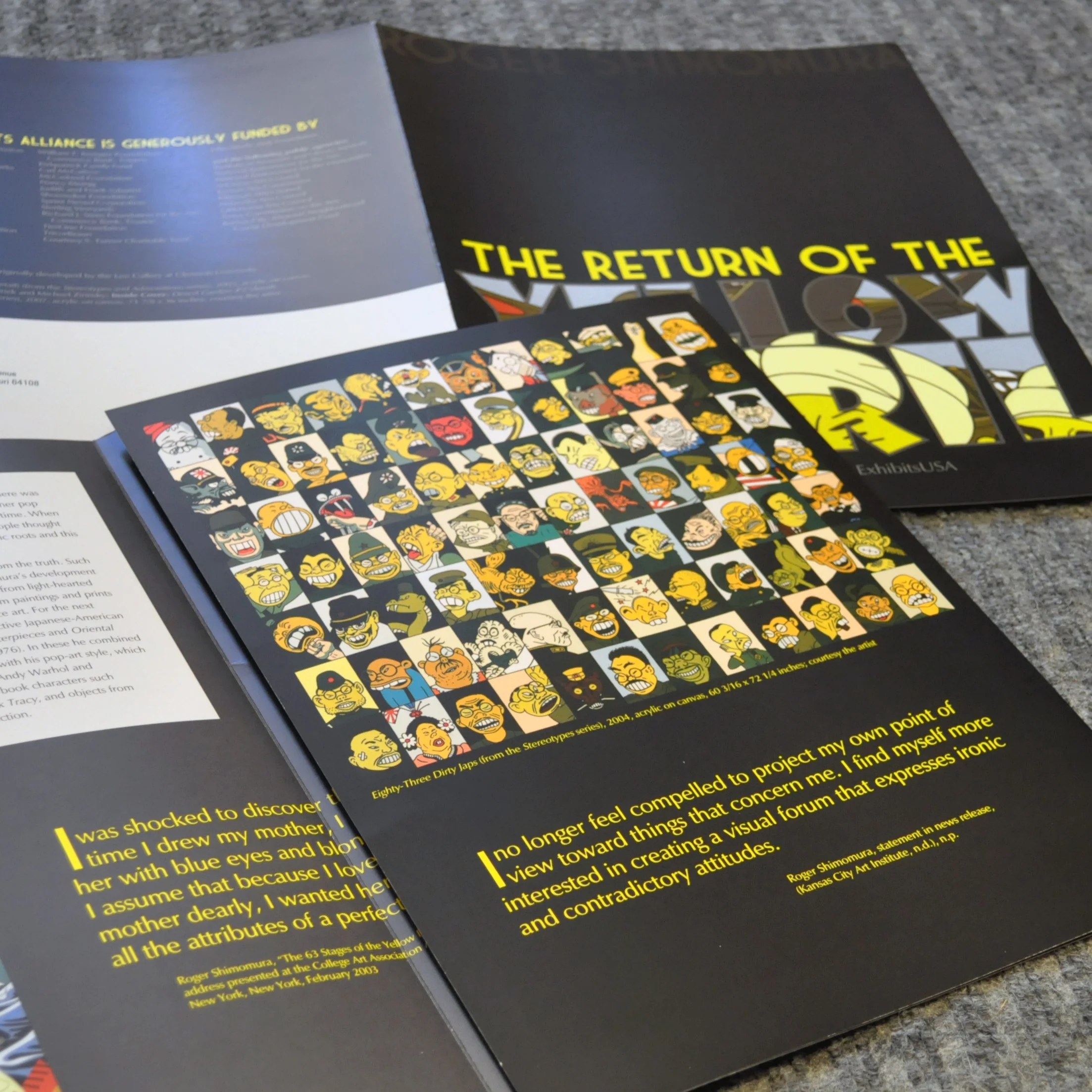
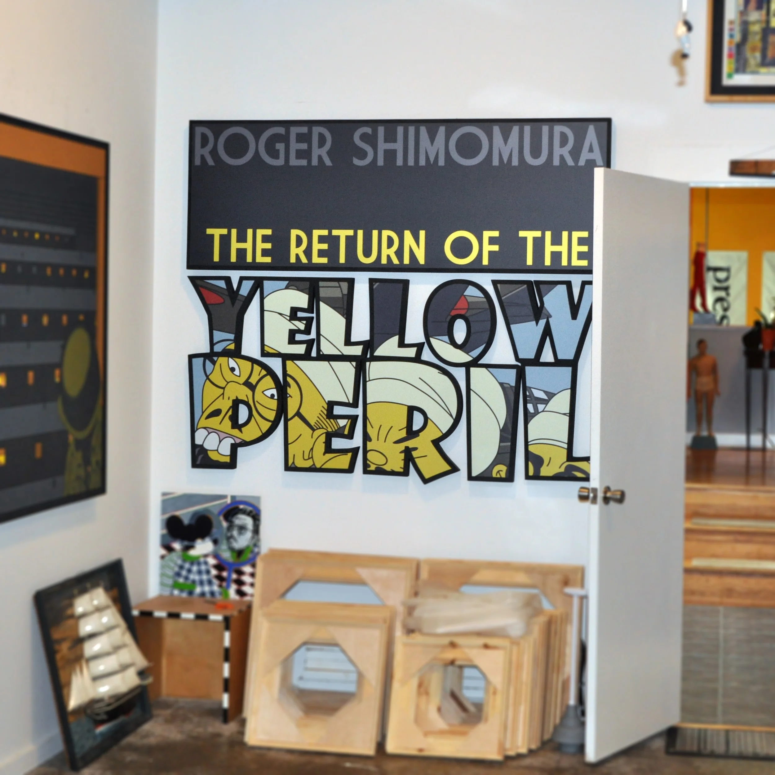
I wasn’t sure Roger Shimomura, the artist of this exhibition, would let me do this design. The fonts are sort of art deco and Dick Tracy inspirted, but when juxtaposed to the imagery, it makes for a very garish design, which is what I was going for. Roger ended up saying it looked ‘nasty and edgy’ which I thought was bad, but he then said he loved it and to move forward with the design. I used a gloss UV coating to imprint his name on the cover so that the cover art stood out.
I loved reading about Roger Shimomura’s work and life. I was familiar with his art but I hadn’t realized the amount of racism he experienced. His work also opened my eyes to historical instances of racism toward Asian Americans. To keep all of this content in the brochure, I designed a 4 panel roll fold so that we could provide enough imagery and content for the audience.
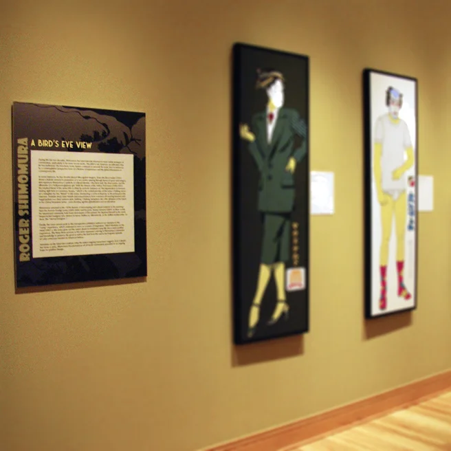
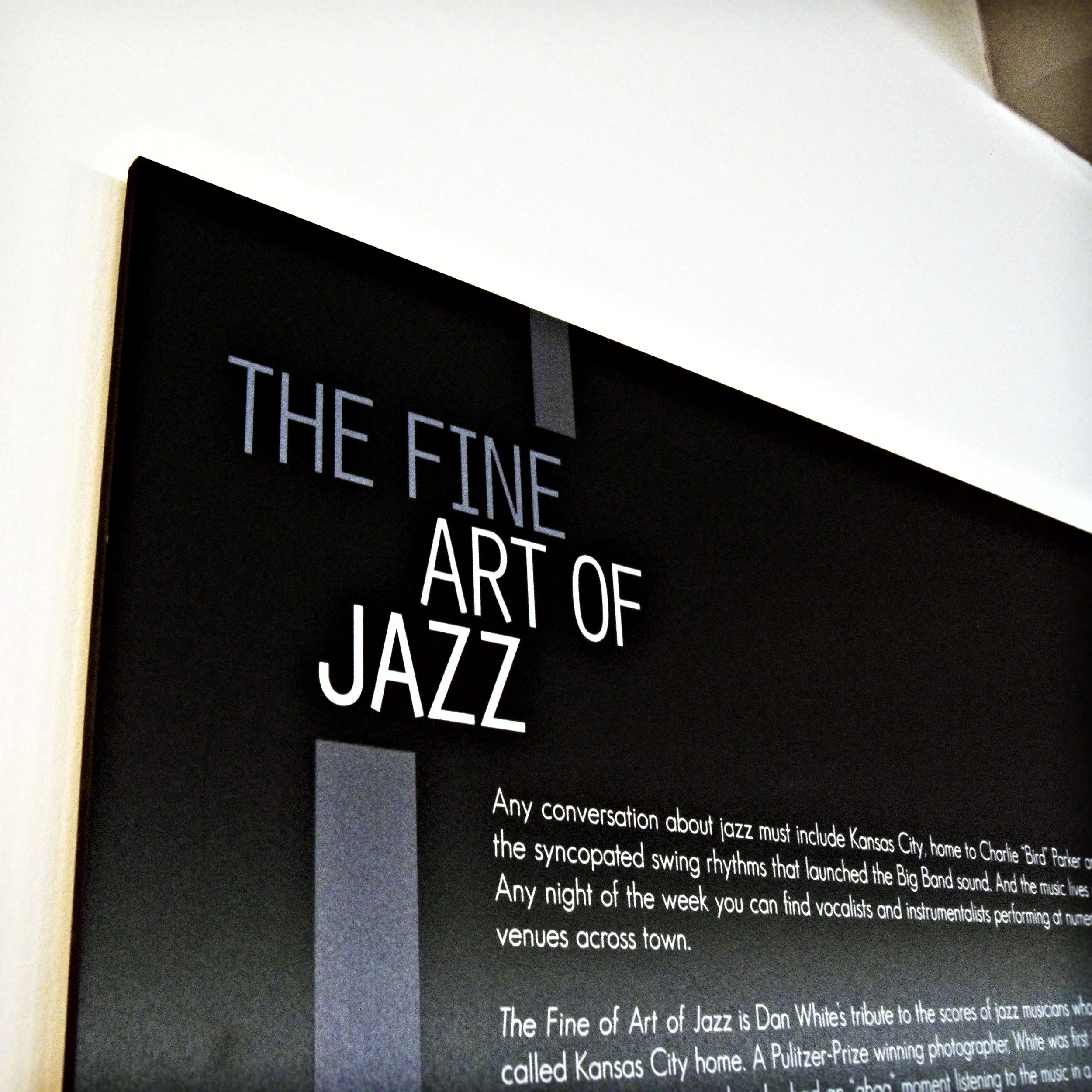
For all the exhibitions I worked on while designing at M-AAA, I also created wall text panels that led the audience throughout the sections of the exhibition.
One of the best compliments I could receieve was when I visited Roger Shimomura’s garage studio and signage from the exhibition I designed was hanging there.
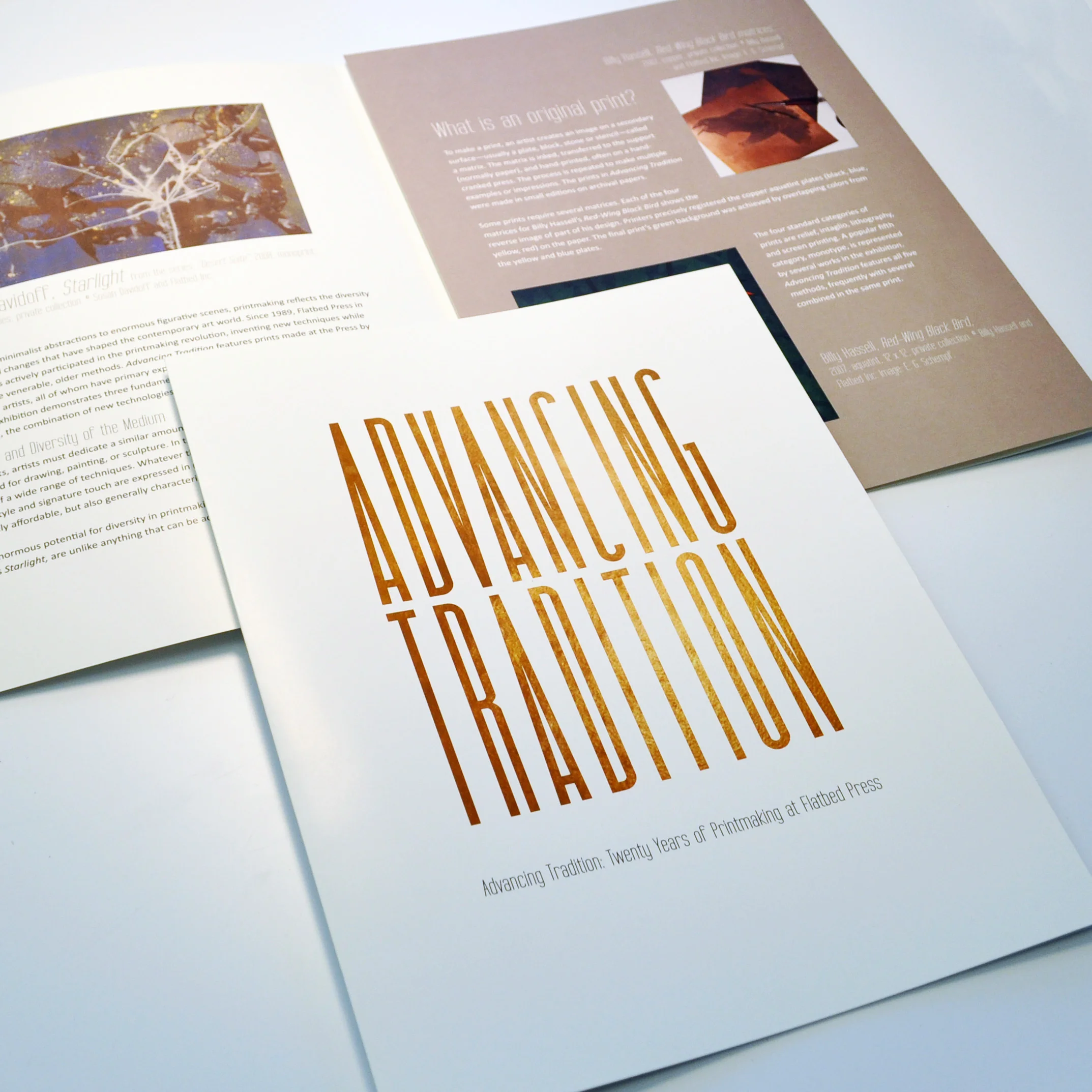
I am a huge fan of printmaking and was so excited to work on this exhibition featuring several printmaking artists. I was inspired by black copper plates and how artists start with this single thing and layer and play with chemicals and etch until something magical appears. So, I used copper plate texture in the font. I also tried to keep design elements minimal so as not to clash with the variety of art featured.
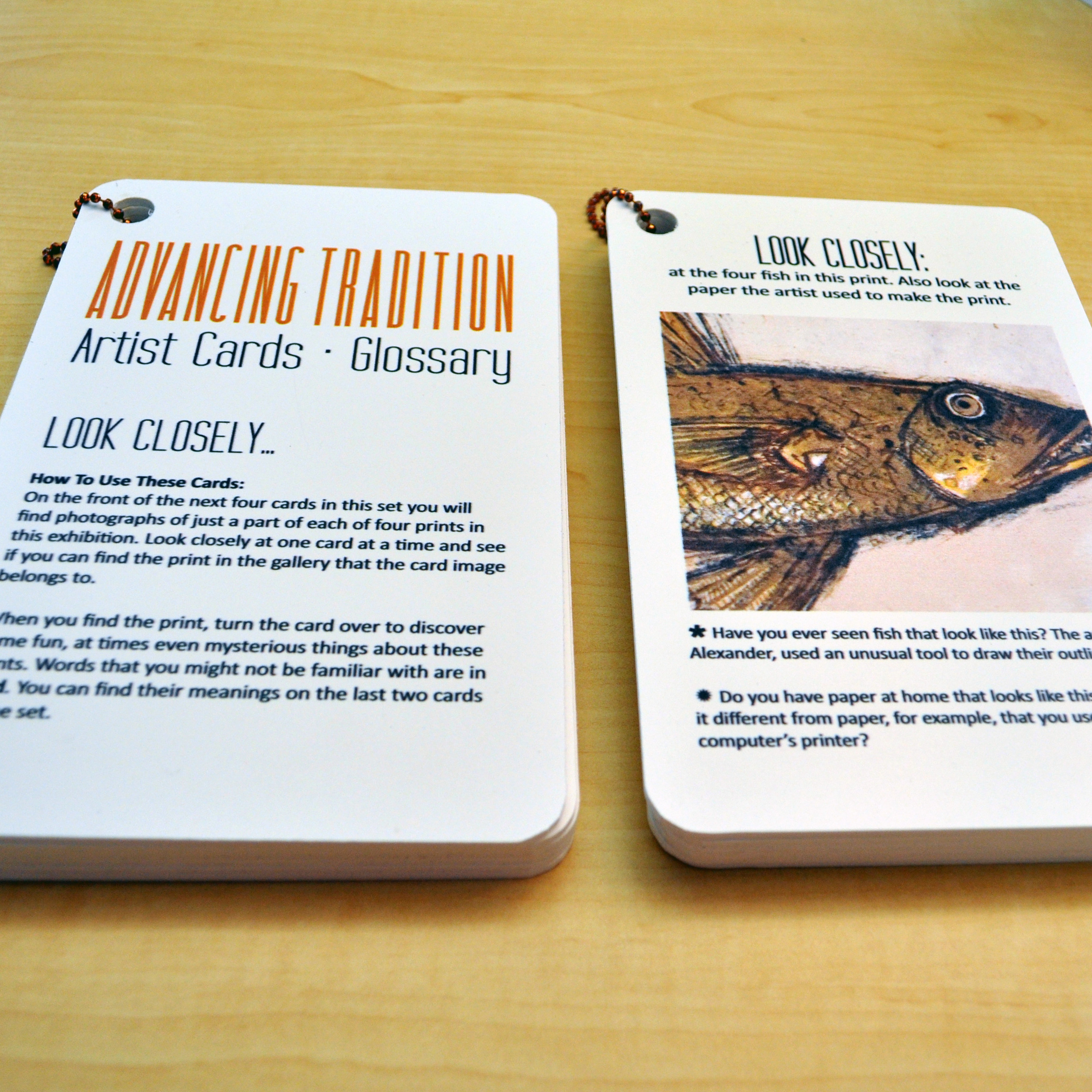
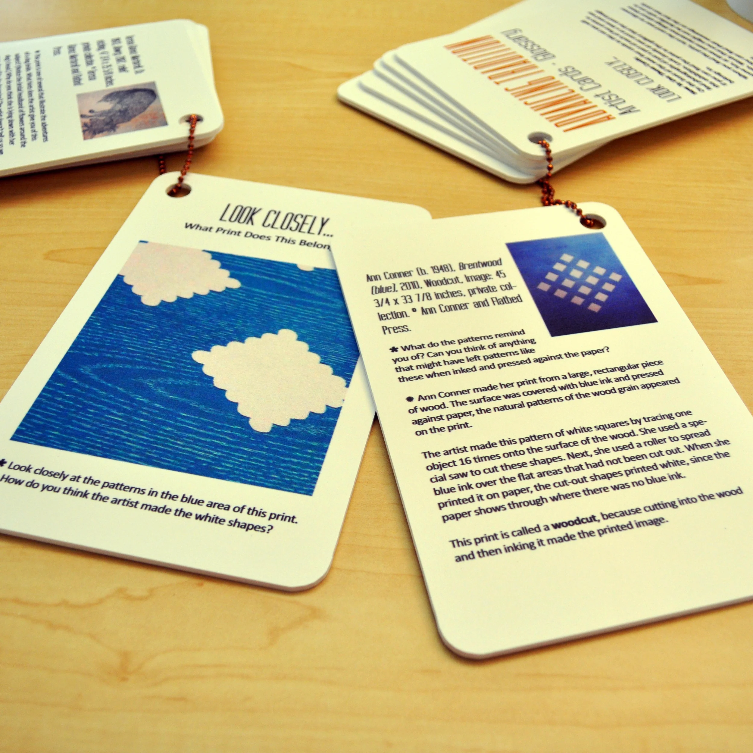
I created this activity by printing direct to sintra (PVC sheets) and having holes drilled into the corners. Simple hook and ball chain held the guide together, and venues could easily hang these up for kids to walk through the exhibition and explore.
The benefit of printing a gallery guide direct to sintra and rounding the corners, it makes the guide kid-proof, drop-proof, water-proof … it’s almost indestructible. It’s also easy to hold and carry, and inexpensive to reprint.
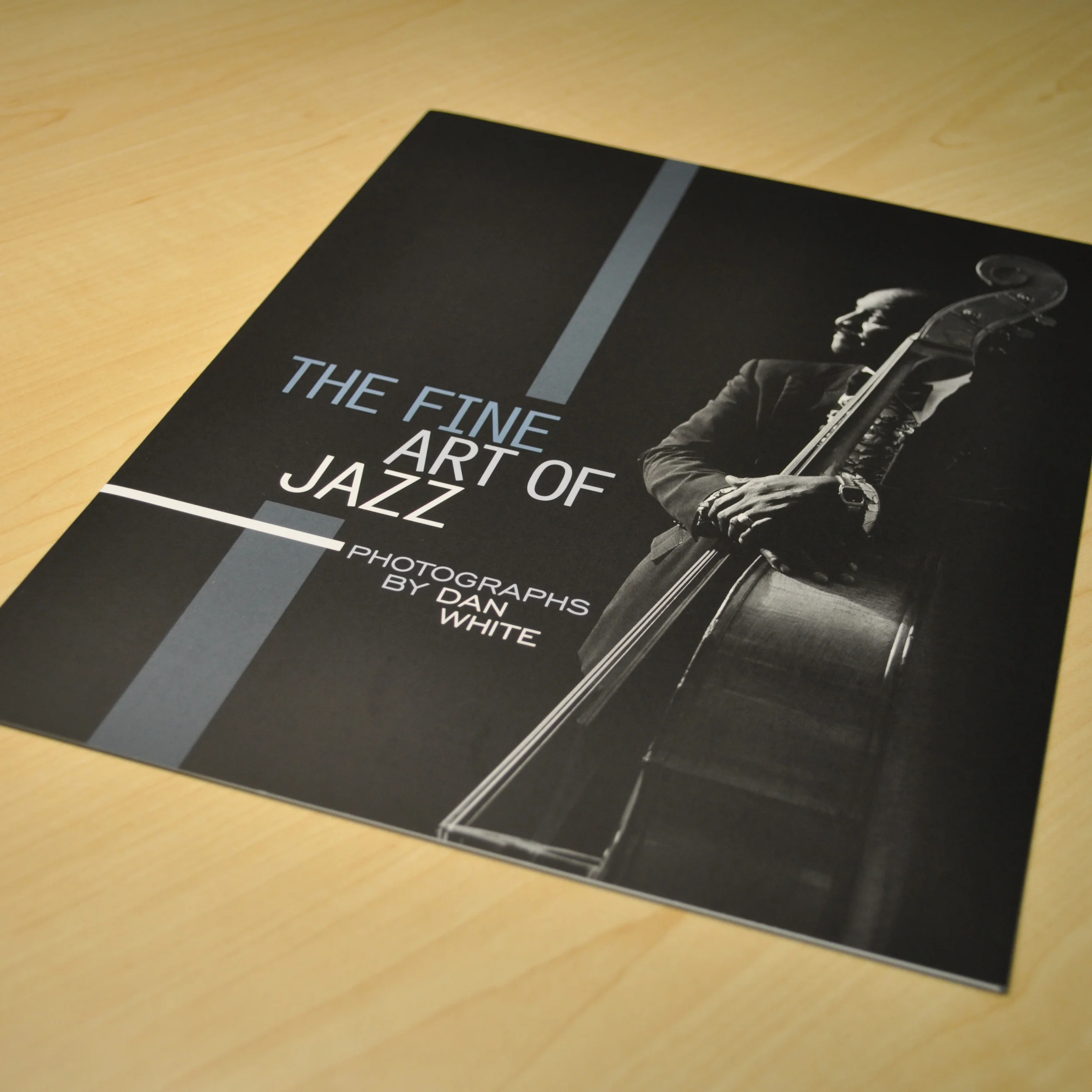
I did a ton of research into mid-century jazz album covers, which was quite enjoyable for me. I saw a lot of samples of bold shapes and moody fonts. I didn’t want to design something overbearing the photography, but I did want to emulate a shadowy jazzy night performance with colors and font.
I loved these images and working with simple graphics to create a certain smoky jazz vibe.
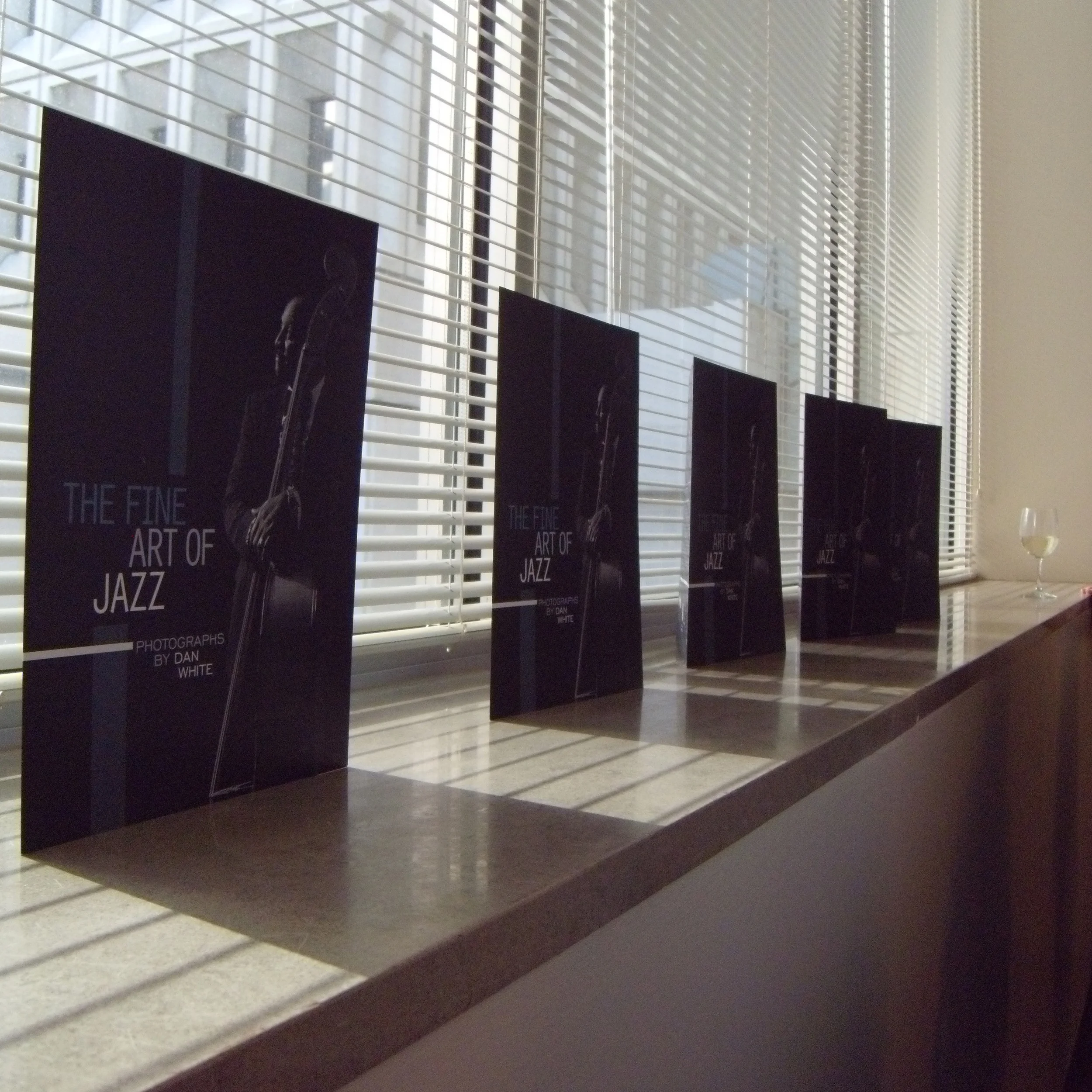
This image may be entirely redundant for a portfolio, but the shadows, the blinds, the music in the background, reminded me a scene from Film Noir.
This is another sample of text panels created for an exhibit. With traveling exhibitions, one never knows exactly how the content will be displayed. Utilizing the posts at the Kansas City downtown library was actually quite successful and I saw a lot of people stopping to read.
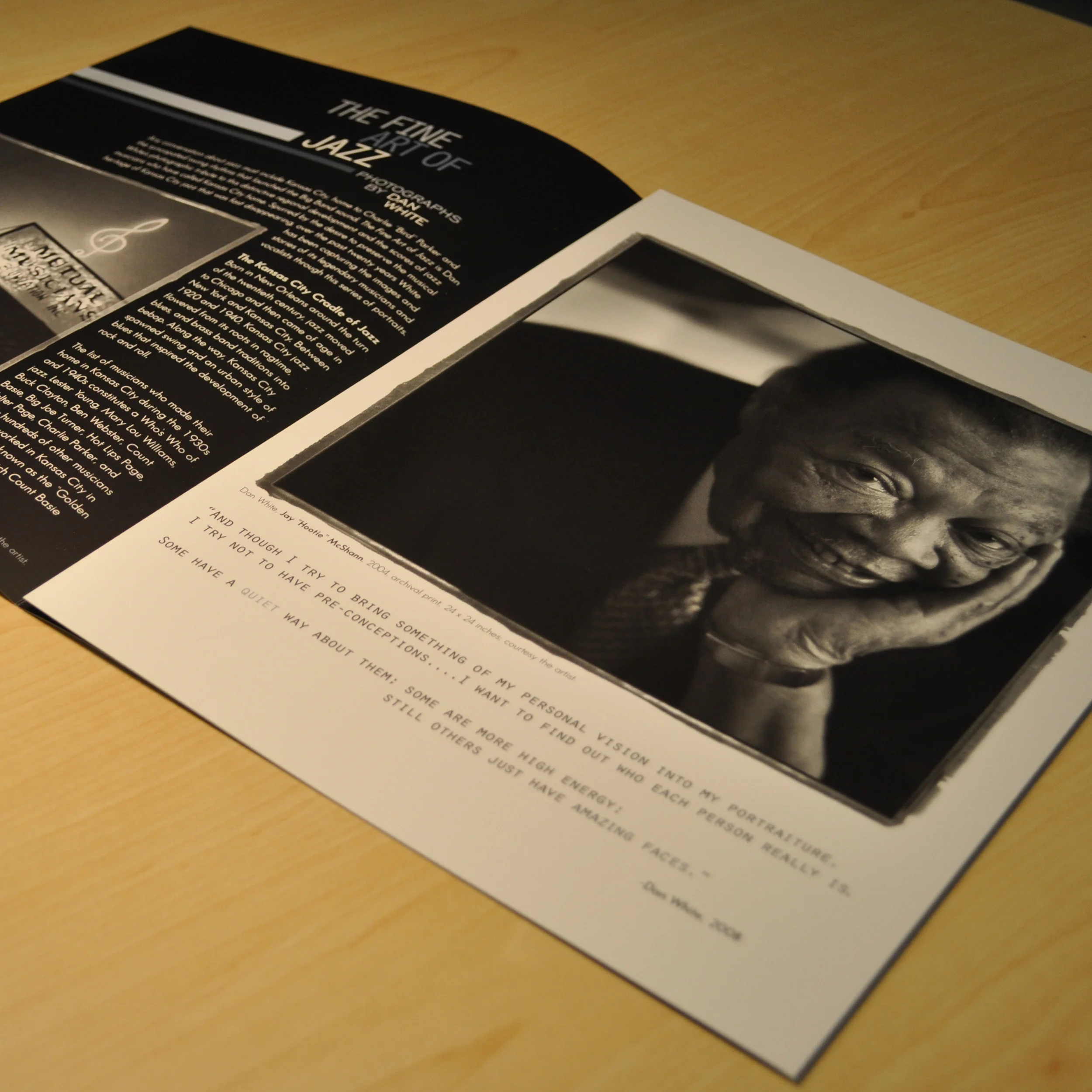
I loved using the raw edge from photography development as a design feature to add texture.
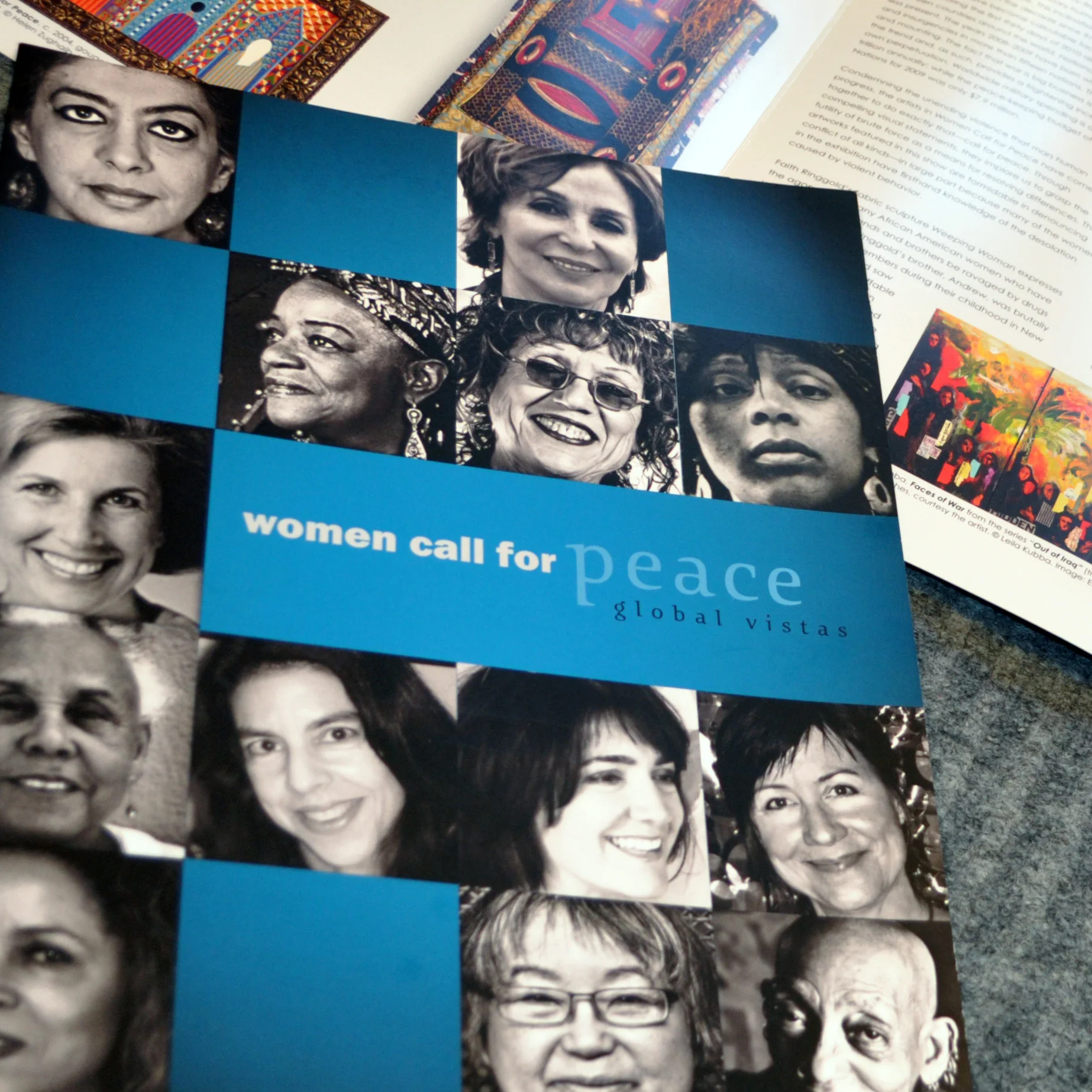
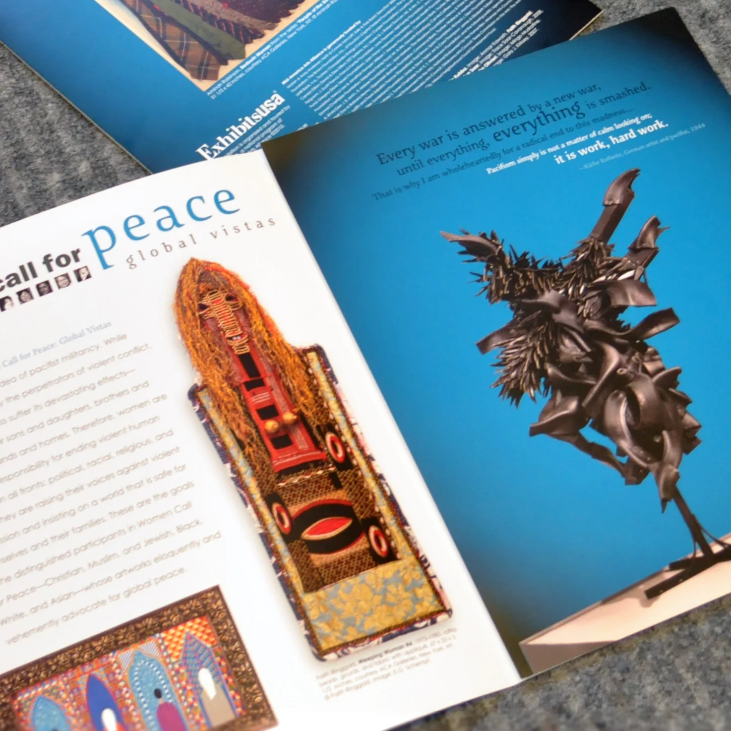
This exhibition featured a group of female artists that advocate for peace and women’s rights. I wanted to feature their faces on the cover, because the art was so powerful, I wanted the audience to know that a diverse group of admirable women were behind this art.
This exhibition featured a listening activity, so I created a room divider out of fabric and tension poles, much like you might see at a trade show. This helped baffle outside noise and created an area to concentrate on the activity.
When designing brochures with art, scale is as important as color quality. I always try to hint at scale, so that the viewer has a sense of what the art looks like while visiting the exhibition.